Why Is Responsive Design Important for Websites?
 hudaibia khalid
In today’s world, more and more people access websites on a variety of devices with different screen sizes, resolutions, and capabilities. This means that it is important for websites to be able to adapt and respond to different device sizes and screen resolutions. This is where responsive design comes into play.
Responsive design refers to a web design strategy that focuses on developing a website capable of adapting its layout and content to accommodate diverse screen sizes and device capabilities.
With flexible design, you can fix many problems with your website. It will make your website easier to use on mobile devices, improve how it looks on both big and small screens, and keep visitors on your site longer.
Read on to learn why responsive design is crucial for your business’ website as well as the advantages and disadvantages of responsive design that you should be aware of before spending money on a design.
What is Responsive Design?
Responsive design is a way to make websites that look good on all devices and screen sizes. It involves designing and developing a website to adapt and adjust its layout, content, and features to fit various screen resolutions, from large desktop monitors to small mobile devices.
In responsive design, the website’s layout and content are arranged using flexible grids, images, and CSS media queries that can detect the screen size of the device used to access the site. This allows the website to adjust its content and layout accordingly, providing a user-friendly experience regardless of the device being used.
Responsive design is important because it allows website owners to ensure their content is accessible to as many users as possible, regardless of their device.
Furthermore, incorporating a responsive design can assist with improving search engine optimization (SEO), as Google and other search engines favor mobile-friendly websites that deliver a positive user experience across all devices.
Why Should You Invest in Responsive Design?
Investing in responsive design can provide numerous benefits for your website and business. Here are some reasons why you should consider investing in responsive design:
-
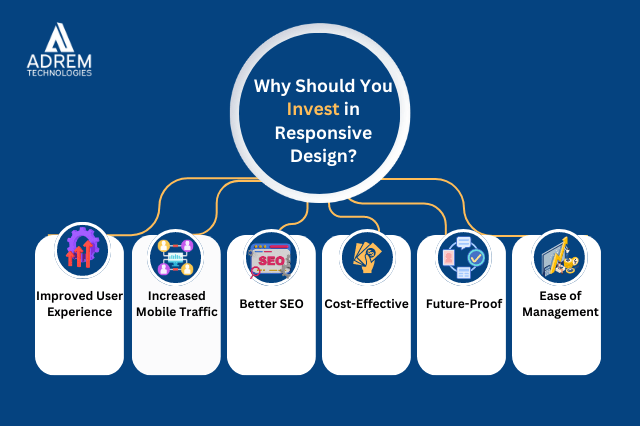 Improved User Experience
One of the main benefits of responsive design is that it provides a better user experience for visitors to your website. Users can access your website on any device and have a consistent experience, which can help improve engagement and conversion rates. A responsive website will also load faster on mobile devices, which can help to reduce bounce rates and improve user satisfaction.
-
Increased Mobile Traffic
As more and more users access websites on their mobile devices, having a responsive website can help to increase your mobile traffic. A responsive website will load quickly on mobile devices and provide a better user experience, which can attract and retain mobile users.
-
Better SEO
Responsive design can also positively impact your website’s search engine optimization (SEO). According to Google, websites optimized for mobile devices will rank higher in search results. Therefore, having a responsive website can help improve your website’s visibility and traffic from search engines.
Read More: Top 10 Benefits of Hiring an Offshore Web Development Team
-
Cost-Effective
Some companies previously created separate mobile websites to cater to mobile users. However, this approach can be costly and time-consuming, as you would need to maintain two separate websites. With responsive design, you only need to create a website that can fit different screen sizes, which can be more cost-effective in the long run.
-
Future-Proof
As new devices with different screen sizes and capabilities are released, it can be difficult to keep up with the changing landscape of web design. However, responsive design can help to future-proof your website by allowing it to adjust to new devices and screen sizes as they appear.
-
Ease of Management
Responsive design can also make website management easier and more efficient. With responsive design, you only need to manage one website instead of multiple websites for different devices. This means that you only need to update content, make changes, and fix any issues in one place, which can save time and resources.
Additionally, with responsive design, you can ensure that your website looks consistent across different devices, which can help to maintain your brand identity and improve user experience. You won’t need to create separate content for different devices, as your responsive website will adapt and adjust its layout and content to fit any screen size.
How Responsive Design Works?
Flexible layouts, grids, pictures, and media queries are used in responsive design to alter a website’s style and content depending on the screen size and resolution of the device accessing it.
Here is a step-by-step overview of how responsive design works:
Flexible Grids and Layouts: The first step in responsive design is to create a flexible grid system that can adapt to different screen sizes. This involves using relative units of measurement such as percentages or Ems instead of fixed units such as pixels. This allows the layout to adjust based on the available screen space.
Media Queries: Media queries are a crucial part of responsive design. They allow designers to set rules that trigger specific styles based on the device’s screen size, resolution, and orientation. Media queries can be used to change the layout, font sizes, and images, among other things.
Flexible Images: Responsive design also involves using flexible images that adapt to different screen sizes. This involves using scalable images that can be resized without losing quality. Techniques such as using CSS background images or SVG graphics can be used to ensure that images are flexible and load quickly.
Content Prioritization: Another important aspect of responsive design is content prioritization. This involves determining the most important content and ensuring it is displayed prominently on all devices. For example, the navigation menu on a mobile device may collapse, and the most important content may be displayed above the fold.
Testing and Optimization: Finally, responsive design requires testing and optimization to ensure the website looks and functions well on all devices. Designers should test their websites on different devices and browsers to identify any issues and make adjustments as needed.
Final Thoughts
Responsive design has become an essential part of modern web design due to the increasing use of mobile devices to access the internet. It addresses the challenge of creating a website that is accessible and user-friendly on different screen sizes and resolutions.
By implementing responsive design, businesses can improve user experience, increase engagement, and boost conversion rates. Additionally, responsive design helps to improve search engine rankings and future-proof websites, ensuring they remain relevant and effective in the long term. Therefore, responsive design is important and necessary for websites that aim to provide an optimal browsing experience for their users.
Therefore, if you want your website to appear responsive, invest in website development services and contact Adrem Technologies at info@localhost to get the best responsive website possible.

